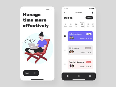
Time management iOS mobile app
Hello friends,
It’s time to tell you a little about the example of this work, what I do: And so, the creation of any design begins with probing the concept. Based on this, the first steps are UX and Style research. The next step is User flow if your application has more than ten screens and the site has more than 6 pages. When we have agreed on this stage, I begin to build a frame for each page or screen. We have passed the UX stage as soon as you approved it.Now a little magic - and the UI stage just begins here. I create two options for the most complex screen or page to define the essential and main design directions. This stage can help create an entirely individual style, and the main thing is that you are really delighted with the result. And now, for a more colorful and juicy impression, I can create custom illustrations for you and bring it all to life with animation. This design works up to show the final result, and many important things happen behind the scenes that you don’t see. But without these steps, it is impossible to get a decent job. How do you like this post format? Give reaction
Design — Figma
Illustration — Adobe Illustrator
************
💌 I am open to new projects! hey@migulko.cz
************

