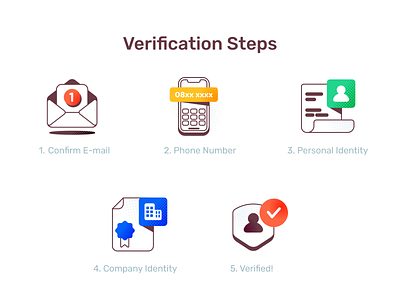
Spot Illustration for Verification Steps
Since the area is limited, I have to use familiar visuals (daily things) to communicate the general message. If users need to confirm their email, tell and show them a literal object. Also, I decided to use bold orange for the verified checklist icon because the primary color of the action button has the same color. The illustration will blend well with the rest part of the UI.
More by Aisha Ahya View profile
Like
