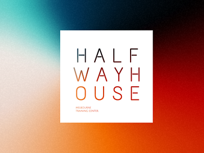
Halfway House Logo
Hey there!
This was a very quick and dirty concept for a logo that was in the works. We ended up taking it in a different direction. But, despite the words not reading line-by-line, there was still something about it that felt kinda neat. The simplicity, the punched out lettering, the space. Figured it was worth sharing a little work in progress.
How would you change it? Let me know your thoughts.
More by Kate Darmody View profile
Like
