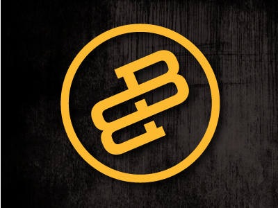
Personal Logo Update...v3
By this point several of y'all might've caught onto my latest little refresh...here's a better look at it. This is what I've settled on...it accomplishes all I set out for: clarity, simplicity, and versatility. I know the circle thing is overdone at this point, but a/ it allows me to change this from one color to two simply by coloring in the negative space within and b/ it kinda enhances the idea of the ambigram I've created here, in that it reads the same no matter which way you spin it.
More by Brandon Brooks View profile
Like

