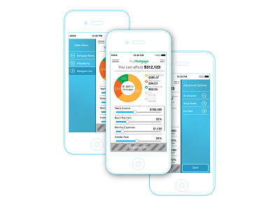
Mortgage Calculator
I haven't seen many shots taking into account a banner ad for iPhone. From a UX standpoint, I'm not sure there is a good way to handle such a beast. Certainly, the loss of 50px vertical is hurtful on such a small screen. Surely, some (likely most?) ads will horribly conflict with any defined color scheme.
More by Kevin Muldoon View profile
Like
