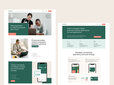
Crezco Website Layout
Let us give you another glance at our design for Crezco, a financial service that enables its users to make payments cheaper and faster but with no loss in convenience. The task for the tubik team was to work on the solid brand identity and effective website which would set powerful brand communication. Here you can see how the layout of the web page echoes the growth chart concept. Stay tuned to see more!
Learn more in the full Crezco design case in Tubik Works.
—
Tubik | Tubik Blog | Behance | Instagram | Twitter | Facebook
More by tubik View profile
Like
