Present Plus
On October 14th 2013 we (Present Plus) kicked off a project to re-design our own website. We, like the rest of the world wanted something different, a new experience. Various iterations of beautiful simplexity and 6 months later, we still weren’t happy. So we set out to do something different. What we’ve landed upon here, one year later, is exactly what we were looking for: a whole lot less.
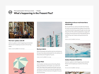
The new site for Present Plus is supposed to take us away from the usual navigation we’ve been used to for the last 25 years and to put the control of the experience in your hands; the user.
We have attempted to build a small search engine, a custom CMS to input questions and answers and a brutal approach to the things we have created over the last 4 years to only show the stuff thats relevant.
We’ve killed off the standard menu bar, incorporated voice recognition and built a site driven by experience and not by page rankings.
Our goal was to just show things people were interested in and try to serve relevance as opposed to sell services.
We’d love to hear from you let us know what you think.
You can also follow me on Twitter where I will keep you posted with updates: https://twitter.com/gielcobben


