WEB ALIGN
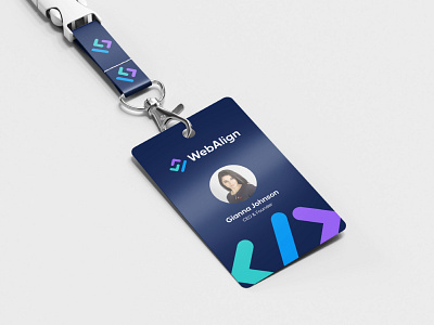
A minimalist thoughful logo that is distinctive, clean, legible and depicts very friendly and developer vibes. The logo incorporates the elements of Letter W and Letter A as abstract mongrams that are actualy the code brackets used in coding for web developement.
The logo is very balanced, adaptable, and scalable to every possible usage, the logo is really relevant and up to your standards and needs as well as timeless.
The typography is designed as minimalist to have proper harmony with logo mark, the typeface used in logo is a geometric and clean sans-serif font “Gilroy - Semi Bold”.
The colors are chosen that are inspired from modernism, I have used Purle, Aqua Green and Blue to seperate shapes and create a friendly vibe for brand.
Looking for a brand agency? We would love to hear from you.
Email us: hello@branddone.co.uk


