THE DRINK SWAP
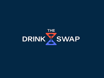
A perfect clever concept designed as minimal abstract mark with a nice use of negative space, it has incorporated the 2 cocktail glasses swapped into each other to represent the brand well. The logo is well crafted to have distinct and unique appeal to it.
The logotype is designed from a classic modern sans serif font “Acumin Wide” which is aesthetically appealing, geometrically balanced letter forms and wonderfully legible also goes well in harmony with logo.
The colors are chosen solid orange and purple with navy as base color for text which reflects DESIGN quite attractive and refreshing vibe.
Looking for a brand agency? We would love to hear from you.
Email us: hello@branddone.co.uk
More by Furqan Dogar View profile
Like


