OPTECSAFE
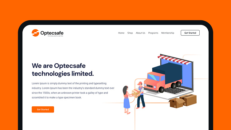


This concept designed as minimalist modern logo. The logo here as well incorporates the abstract containers and tech symbolism along with steps element for forward movement that represents logistics and the whole simlisitics mark is enclosed in a cirle as O letter of Optecsafe.
The logo is very balanced, adaptable, and scalable to every possible usage, the logo is really relevant and up to your standards and needs.
The typography is designed as minimalist to have proper harmony with logo mark and business, the typeface is used are ‘DM Sans Blod’ & ‘Saira Semi Expanded Light’ for subtext/tagline.
The colors chosen are inspired from modernism, technologies, and logistics, chosen one solid orange color for mark and one darkest grey for logotype.
Looking for a brand agency? We would love to hear from you.
Email us: hello@branddone.co.uk
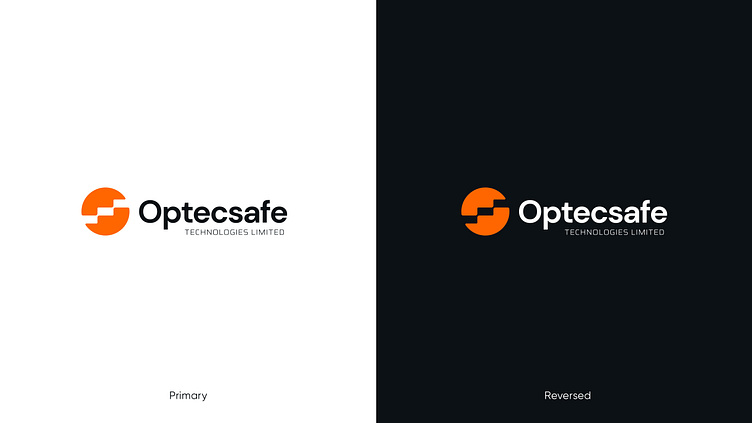
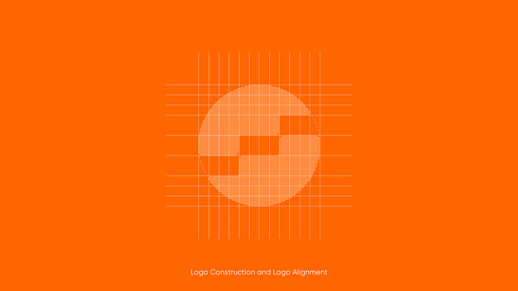
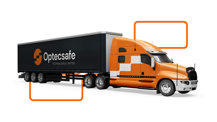
