XO HEALTH

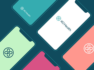


The concept designed as minimalist thoughful logo that is distinctive, clean, legible and depicts very friendly/caring vibes.
The logo incorporates the elements of Letter X, Letter O, 2 hearts hugging each other. Also the logo is very balanced, adaptable, and scalable to every possible usage, the logo is really relevant to business as well as very simple yet timeless in its symbolism.
The typography is also designed as minimalist to have proper harmony with logo mark, the typeface used in typography is a geometric and clean sans-serif font “EuclidCircularA”.
The colors are chosen that were provided, I chosen Dark Blue and Teal that were primary, and they worked very well with logo and in its communicating values.
Looking for a brand agency? We would love to hear from you.
Email us: hello@branddone.co.uk