BMW - logo REDESIGN concept
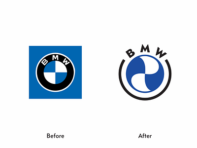
BMW logo really looks good but feels like it has no good black and white version.
History says BMW was a airplane engine manufacturing company and the logo was made looking at the airplane blades.
So I've taken that idea little bit further and make it better for one color version.
Let me know if you agree with this redesign??👂👂
Like and share if you care.💖💖
▪️ Available for work
▪️ My portfolio link Click here
▪️ Please show some Support & follow for more
Have a great day!! 🤗🤗🥰🥰
