Data Analytics - Financial Aid

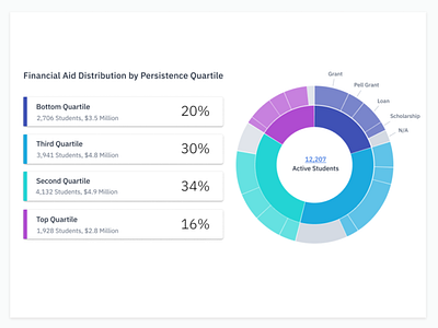
This chart allows a University Administrator to view how financial aid is distributed among the student population. Breaking it down by persistence quartile, Administrators can see if financial aid is going to students who need it most. They can begin to answer questions like:
If students in the bottom persistence quartile received more aid, would they be more likely to persist?
What percentage of students in each quartile are self-paying for their tuition? Would they be more likely to persist with some additional aid?