"Motorola" logo redesign concept
"Motorola" logo redesign concept.🤞🤞
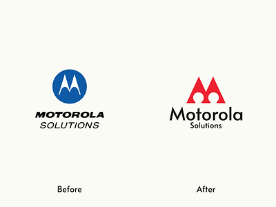
Made the logomark little bit look like M.The logotype feels dated to me. So I've chosen a modern sans-serif typeface for it.
Let me know if you like this redesign concept?
Like and share if you care.💖💖
▪️ Available for work
▪️ My portfolio link Click here
▪️ Please show some Support & follow for more
Have a great day!! 🤗🤗🥰🥰
