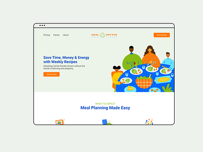
MealBetter • Website Redesign
The Mission
Redesign a website that was user-friendly and encouraged users to signup for the waitlist. The previous design was focused on the brand, graphic elements and getting the content up, my focus was to ensure the website made sense from a user perspective.
The Strategy
After completing an audit I restructured the website through a sitemap and wireframes to focus on the users journey. I then applied the visual graphics in a while that is playful and engaging.
Let's Connect!
Portfolio brittanysteiner.design
Instagram @bsteinerdesign
More by Brittany Steiner View profile
Like


