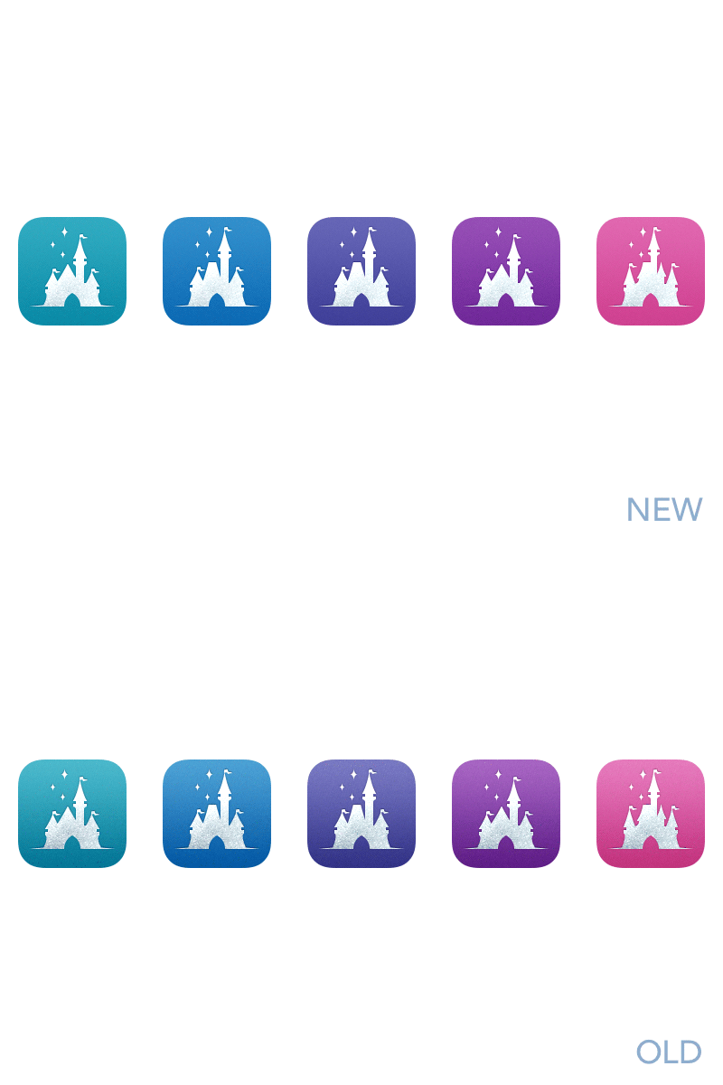
Magic Passport Icon Refresh
Prepping a new version of Magic Passport to support new devices, and I took a moment to re-evaluate the icons.
What I found was that I had too much contrast in the background gradient and not enough contrast between the castle and the background.
So I brightened the castle and made a less harsh gradient on the background. I also removed the primary background texture but left a little noise.
More by Pacific Helm View profile
Like
