L&T logo redesign concept
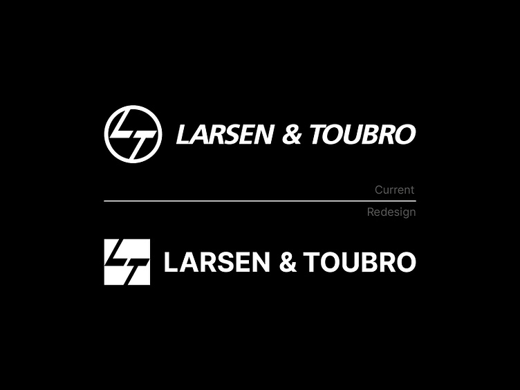
Larsen & Turbo is a huge company. I felt, lets try to redesign there logo as the circle is not balancing in the mark, so I used a square shape.
Would love to hear from you all
Larsen & Turbo is a huge company. I felt, lets try to redesign there logo as the circle is not balancing in the mark, so I used a square shape.
Would love to hear from you all
