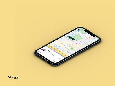
UX & UI for Viggo
Hej ♡
This is a screen Viggo's user sees when waiting for a booked ride. Due to GDPR, I had to redesign the previous solution in order to comply with the regulations and communicate clearly the waiting time and vehicle position to the rider.
"Viggo is re-thinking the concept of urban transportation and combining leading technology with zero-emission vehicles. Without compromising on efficiency and price, they aim to offer the most environmentally friendly and convenient mobility solution seen in Scandinavia."
I was working with Viggo as a UX / UI consultant. You can find more of the shots of my cooperation with Viggo here.
More by Frederik Smal View profile
Like
