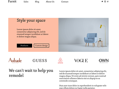
Furnit - Landing Page Redesign
My UI sis (@xd.rue on Instagram) challenged me to recreate this layout here. I'm not sure she was 100% impressed, but it felt good designing with vertical and horizontal grids for the first time.
Some things I like about my design:
1. The overall look is light, bright and visually appealing.
2. There is a good use of white space
3. All images used are of the same visual style
4. The typography is both inviting and minimalist, in keeping with the rest of the screen.
I have also begun to learn for myself the importance of creating visual balance and weight density on a screen, as well as how much easier it is to do so with grids. This task provided me an interesting new challenge and some much needed practice.
This is my first "proper" share of my designs and I'd love any feedback or tips to help me improve. Feel free to use this as inspiration for your own design journey, too. Thank you!

