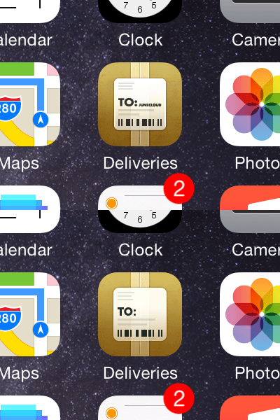
Deliveries 6…?
As I finish up Deliveries 6.0, I couldn't help but poke at the icon a little. Especially after creating the simplified version for the Action extension. I've been tempted to tweak this icon for a while, and creating that simplified version convinced me it was worth exploring.
So my goals were:
• Get rid of unnecessary details that don't really help the icon.
• Don't get rid of anything just for the sake of being flatter or simpler—even Apple's icons use thin lines (Maps), shadows (Passbook), and highlights (Camera) when it helps define the shapes.
• As long as it looks just as good, align things to the 1x pixel grid so the various sizes can be more consistent.
• Keep the same personality.
I'm still in the "look at it a lot and try to get used to it" stage, but right now I'm digging it and it seems objectively improved.
