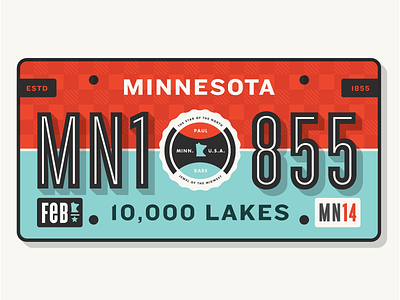
MN License Plate
My buddy Jonathan Lawrence (http://jonathanlawrence.net) asked me to redesign the Minnesota license plate.
I know I've always wanted a flat black plate with dark gray Helvetica left justified (kerned tight but not touching). But what fun would that be?
I decided to try something with a ton of personality and Minnesotan to the core. This has a Paul and Babe theme with midwest design aesthetic.
It's a work in progress so I'd love any feedback:
Should it be more simple?
Is the Paul and Babe theme lost?
Is the plaid to distracting?
Do you like the font choices?
Thanks!
More by Allan Peters View profile
Like

