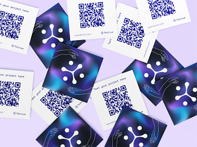
Thirium logo&branding
The challenge:
The task was to develop a logo and identity for an automatic tests platform. The brand should embody technology and be easy to communicate with. The name looks like a chemical element, and the logo should reflect that. The brand's character is friendly and open.
The solution:
Cold colors are accociated with IT, all forms are simple and smooth. The benzene ring at the base of the logo provides a bond with chemical elements. Hand gestures show the brand as a friend and partner.
Full case you can explore on my Behance! Feel free to appreciate and comment!
Contact me for discuss your project on Telegram
Or mail me alyona.ivanushkina@gmail.com
More by Alyona Shtrudel View profile
Like
