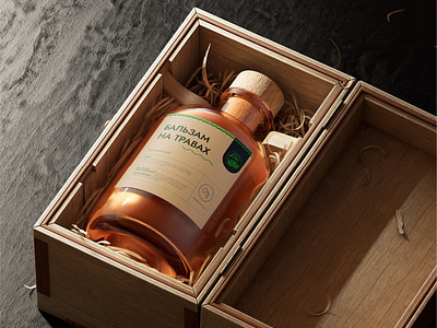
Made in Amur logo&branding
The challenge:
The task was to develop an export logo for the Amur Region. The logo should be universal, convey the naturalness and quality of the product. Associations: proximity to China, eco friendly, naturalness, confluence of two rivers.
The solution:
The main shape is Komarov's lotus. Lotuses grow in the Khingansky nature reserve of the Amur region, they are a symbol of cleanliness and eco, harmony, and also closely related to Buddhism and China. The lotus in the logo is not fully revealed, which speaks of the region's development prospects. The confluence of the Amur and Zeya is the Amur Region's geographical symbol. The rounded shape and the text is associated with the stamp, which speaks of the product's quality.
Full case you can explore on my Behance! Feel free to appreciate and comment!
Contact me for discuss your project on Telegram
Or mail me alyona.ivanushkina@gmail.com
