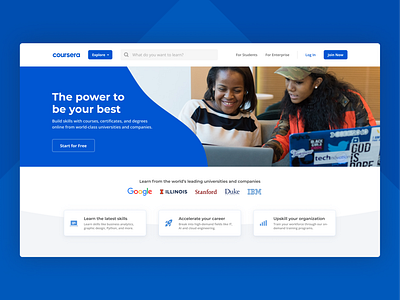
Coursera Homepage Redesign
A shot I started awhile back that I'm finally content enough to share – back before Coursera's recent rebrand, I tried my hand at redesigning their logged out homepage experience!
Coursera is and has always been about empowering people, so for this redesign I wanted to really focus on the platform's value proposition to individuals and their own personal growth. Thus the tagline: "the power to be your best".
Feedback is welcome!
Fonts used: Montserrat & Open Sans
More by Tyler Nickerson View profile
Like
