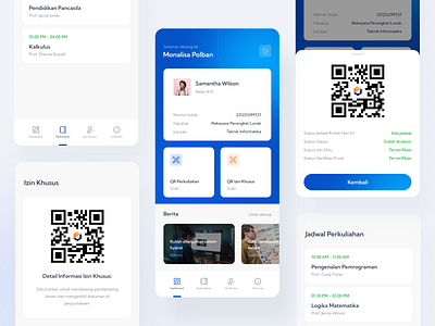
Politeknik Bandung Students Monitoring App - Redesign
Hi,
A friend of mine showed me "Monitoring Jumlah Populasi Mahasiswa (Monalisa)" app essentially it allows the university to track their students since they wanted to do an offline teachings in their campus. And of course there are precautions to take such as a check if their students has been vaccinated, has their parents' permission, and if they have a course that day. So its purpose is simple, but I have noticed the design that they have currently is not exactly up to date with UI designs roaming around the internet today.
I took it as a challenge for myself to redesign the app not just from the UI standpoint but also UX-wise. A couple of changes that I have made is that making the button for QR perkuliahan and QR izin khusus under the student's biodata because its the most important feature the app is meant to be used according to them.
Feel free to give me a feedback, I'd appreciate it a lot!
