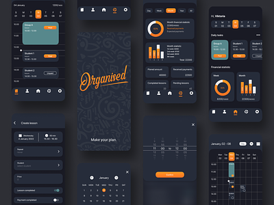
Organised app dark mode.
Hi friends!
When I redesigned the Organised app, I had a task to make it also in a dark solution. The dark mode has long been an integral part of the device interface. The dark mode not only looks aesthetically pleasing, but also significantly relieves eye strain at night and some users find it easier to read light text on a dark background. Let me know what you think.
Share some love by pressing 'L' if you like this shot.
I'm available for freelance projects. donetsdesign@gmail.com
Thank you.
More by Vadim Donets View profile
Like


