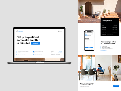
Mortgage product page layout
One last stylistic exploration - this time based on Opendoor's mortgage product page. I hope you noticed how much stuff I crammed above the fold on this one while keeping the layout super spacious.
I could rev like this forever but I'll close the style explorations, until next time. I had fun indulging in all this whitespace and scale photos this big.
More by Opendoor Design View profile
Like
