HF logo

Got any thoughts? I feel like this is good to go.
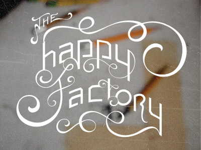
Differences from the last shot: I ditched the circle, (thanks to some suggestions by R.A.), and also changed up the corners to lower the knife-like qualities.
Got any thoughts? I feel like this is good to go.
Differences from the last shot: I ditched the circle, (thanks to some suggestions by R.A.), and also changed up the corners to lower the knife-like qualities.