JRS - ADVOCACIA


🇧🇷Branding desenvolvido para a empresa JRS - ADVOCACIA.
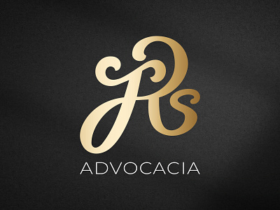
O objetivo dessa empresa era ter uma identidade moderna e inovadora, algo bem exclusivo, que sai-se do padrão do segmento de advocacia.
A ideia foi fazer uma junção das iniciais de uma forma continua, para que mostrasse união e solidez, fazendo alusão a relação entre advogado e cliente. Além disso, a letra "J” têm uma construção para referenciar uma "balança da justiça”, trazendo ainda mais significado e peso à marca.
🇺🇸Branding developed for the company JRS - ADVOCACIA.
The objective of this company was to have a modern and innovative identity, something very exclusive, which leaves the standard of the law segment.
The idea was to make a junction of the initials in a continuous way, to show union and solidity, alluding to the relationship between lawyer and client. In addition, the letter "J" has a construction to reference a "scale of justice", bringing even more meaning and weight to the brand.
-----
💌 Contato para projetos: contato@noweb.io
👋 Descubra mais sobre nós: