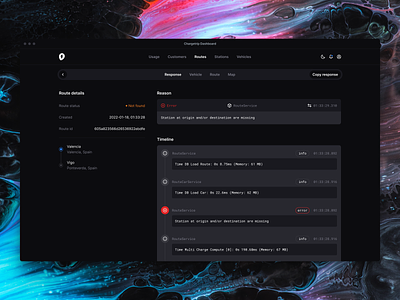
Chargetrip - Internal Dashboard
In this shot a small peak behind the scenes. To manage our services at Chargetrip we often build custom internal tooling like this route debugger. To give it a home we build an internal dashboard.
While doing so we explored some new navigation patterns. At the moment our dashboard runs at 100% width, with navigation scattered in the top and left side of the screen. This attempt tries to bring everything more together at the top.
It also reduces lots of white space on larger screens because it uses a fixed width layout. We still exploring but this one might be a winner. If that's the case we will most likely bring it back to our customer dashboard and developer portal.
Stay tuned!
More by Wouter van de Kamp View profile
Like
