Interactive Chart for #DailyUI
TASK (from #DailyUI)
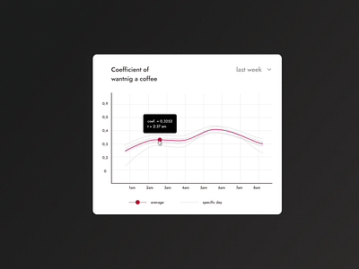
Create a diagram.
To make a task more specific, I assumed:
The main information should be interactive. The user should have an ability to watch more specific information.
It will be used only on Desktop
INSPIRATION
The whole design is based on Futura typeface.
Why Futura?
Actually, I use Jost typeface, which has got a lot in common with Futura. This is driven by the fact, that Jost is free and open to use.
Some historical context from Wikipedia: Futura was made in 1927 in Germany. It feels very close to Bauhaus, the style of that time and place. My little aim was to steal those emotions to my design.
Bauhaus is the style of time-tested objects. It is stable, proven and convenient to use. This emotional association would benefit the whole feeling of the design.
Bauhaus and Futura influenced the design with:
Typeface
-
The colours, especially with low contrast between minor elements and with main control focused with vibrant tone
AFTERWORD
1. In some cases, I think, the DIN typeface would work better. I am still hesitating.
2. This is totally subjective thoughts, but proven with general-known facts. In case you find any mistake - write a comment or text me in Twitter.
