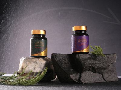
SamiSaz Pharmacology Labeling design
Apart from the sensitive aspect of the medical packaging industry, there is always the matter of giving a positive vibe and conveying the right emotions. That's because customers looking for these kinds of products have a high percentage of stress and anxiety that won't be good for their mental and physical health. Needless to say, a rich-user-experience product packaging that would reduce customers' negative energy will be one that's going to get picked.
That was exactly what we accomplished in the SmartCaps medicine product label design. These herbal pills that are advised for Diabetes, high cholesterol, and Cardiovascular disease need to look lively. That means that there was no place for complex and twisted elements in this design. Since the design had to be as transparent and minimal as possible, we focused on choosing readable and scrutable fonts, well-instructed paragraphs and making a clear context to avoid any confusion whatsoever.
We also used golden-green and golden-purple for the labelling colours. Gold has been able to prove the product's high value and also symbolize sunshine, which in itself inspires light, hope and energy. On the other hand, Green represents vitality and health, and purple also gives out a calming vibe to the audience.
