Logo design, brand identity and packaging design of O Hanami
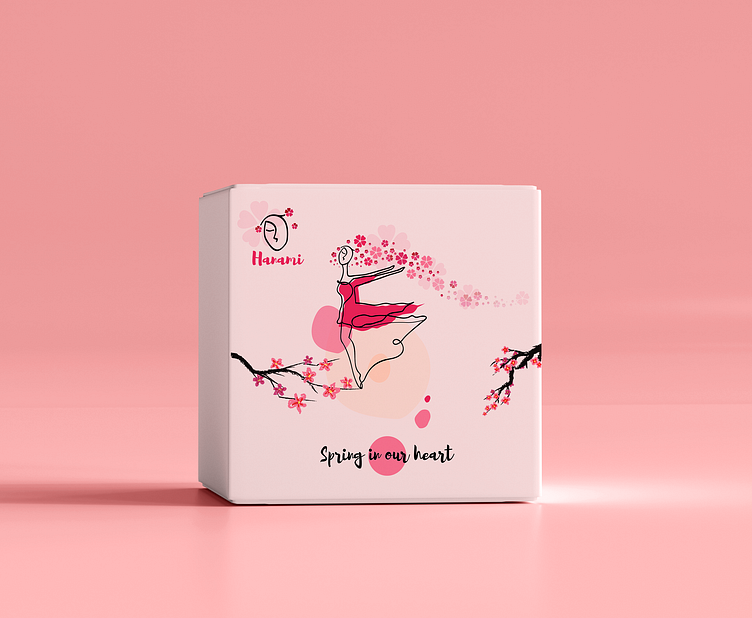
O hanami is the Japanese traditional custom of enjoying the transient beauty of flowers. The brand is making beauty boxes and sells cosmetics and beauty products.
The project was made in Clipart. My role as a designer was to create an unique logo and brand identity, that would match and fulfil such a wonderful concept of a blossoming flower in our hearts.
Logo is a combination of the letter O and a face, with eyes shut as a symbol of enjoyment by feeling the beauty of sakura flowers blossoming. Overal style is in line art because of the peaceful and calm visual of eternal lines.
For printing materials I painted a unique character for the brand - A girl, who dances and enjoys all the beauty in her heart.
That's a link to the whole project:
https://www.behance.net/gallery/135167951/Logo-design-brand-identity-and-packaging-design