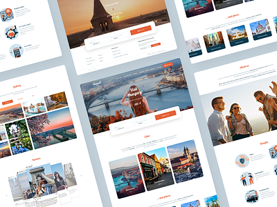
Redesign of tour`s landing page
Hi there everyone!
The old tour`s page has complicated navigation and it`s design is outdated. Here is the link for old tour`s page: https://www.accordtour.com/tours/881060/vse_avtobusnyye_tury/vengriya/tab/tab_descr
I wanted to make the page easier to use and more enjoyable for a younger audience. By the way, it is young people who are main audience for such type of recreation. I found this out during research on tourism practices.
I will add a link to the Behance with a detailed description of creating that landing page and research a little later.
Feel free to leave feedback and comment.
Don't forget to press "Like" if you like it.
Thanks!
More by Yuliia Havriushova View profile
Like
