EPTI design challenge #1:
EPTI design challenge #1:
All the new year’s resolutions that we made need a place to live. Design a ToDo App to host them.
Solution:
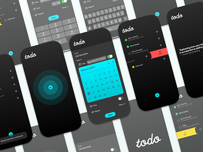
A simple todo list.
The core is simplicity, a task written down is better than a task forgotten.
My goal was to keep the UI minimal and only show what is relevant. To keep the screen clutter free so that the user can feel a sense of tranquility when the list is done. No warnings about tomorrows tasks, no repeating tasks or productivity visuals. Just a simple todo list.
Reasoning:
To make a todo list with it all, a calendar, lists, alarms, gamification and all the bells and whistles is the first things that comes to mind. But is that a good app to solve the challenge?
A complex app that seems more like a calendar/personal journal sounds like more job to keep tidy rather than focus on finishing the to do's in said app.
New years resolution or even simple day-to-day tasks is always challenging to note down and to finish.
In my own experience I’ve used Bullet journal's “Rapid Logging” to note down what to do, take meeting notes and scribble down ideas in a fast and easy way.
Functionality:
I created the base that a task can have 4 different states: Not done, done, moved or deleted.
If a task is done, or checked off then a simple green checkmark will indicate this. I choose to keep the list item for the user to feel a sense or victory.
If a task is moved (swipe to the right on the item) it’s moved to the next day. The item is still in the list so the user doesn’t forget what had happened to said item.
If a task is deleted (swipe to the left on the item) it gets removed, no popups that asks if the user are sure, just deleted from existence. Misstakes shouldn’t linger in our todo list.