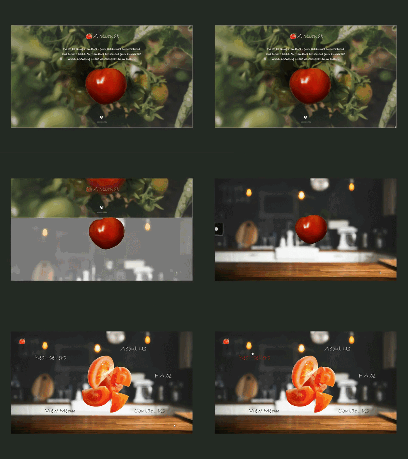
Tomato Culinary Experts - landing page animation
MY. FAVOURITE. DESIGN. SO FAR. HANDS. DOWN.
I took inspiration from a beer company website (which I forgot the name of, sorry!) that I chanced upon a few months ago while randomly surfing the net for website design ideas. "Plucking" the tomato which then lands in "your kitchen" not only boasts a fascinating animation, but also signifies how fresh the tomato produce is.
Antomat is a play between the words Antoinette - the name of the persona of the chef/business owner, and Tomato. I just love how all the ideas for this design pieced together beautifully, creating a fictional tomato-based culinary eCommerce website.
Check out the next post for part 2!
-
Appreciate every like I get on this post.
Hit Follow and stay connected!
More by SAW View profile
Like
