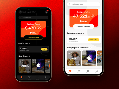
Mokka App Redesign
I was glad to redesign the main screen of the Mokka app because the current app had a lot of problems with UX and UI.
I suggested also a dark theme that looks better (richer) than the default theme.
I really like that. And you? Just press L
More by Artem Kobyakov View profile
Like
