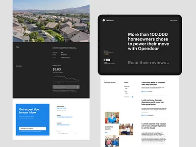
Internal page layout
Some more web full bleed layout exploration with huge headline, image and margins. The sizing seems to allow for flat color background without making the page vertical flow too stripy. The dark hero section is so bold and clean without CTA - never going to happen anywhere else than on a conceptual mockup.
More by Opendoor Design View profile
Like
