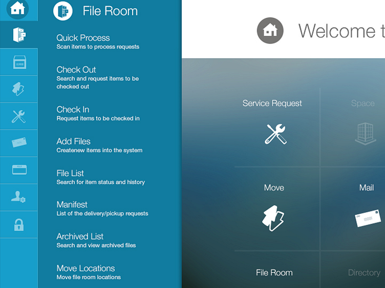
iOffice Dashboard
Kenton was looking for a dashboard look that combined windows 8 and ios7 look and feel. So I went with bold colors on navigation and a gorgeous blurred image on the main dashboard page. I think the effect came out quite nice! What do y'all think?
More by Heather White View profile
Like
