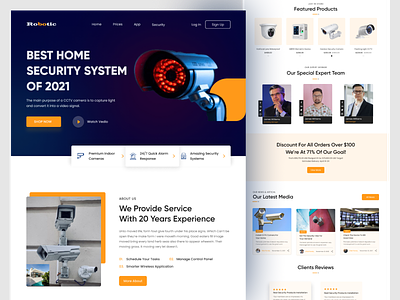
Camera - Landing Page Design
Hello Dribbblers,
I tried to make it look clean with more empty space and tried to use some bright colors for the design to make it look interesting.
Please share your feedback about the color choice and placement of the elements.
I upload fresh ideas and freebies on daily basis both on Instagram and Dribbble. So make sure you follow me on Dribbble too.
Follow Me On Behance: behance.net/ahmadkawsar
Follow Me On Linkedin: <a href="https://www.linkedin.com/in/ahmadkawsar/">linkedin</a>
More by Ahmad Kawsar View profile
Like
