Logo / App Icon for #VirtualConference 2
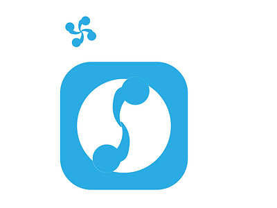
This is my second attempt at designing a logo for a virtual conference app/website. I tried a bit of layered-look for the App icon to give it a more minimalistic look. I also dropped the multi-color heads from my first attempt for the same reason, but it also signifies similarities.
Unlike the app icon, I choose four people for the logo. First, to give it a fuller look. Then, I felt that four would crowd the icon. But then, it also signifies four directions N, S, E and W - global connectivity.
