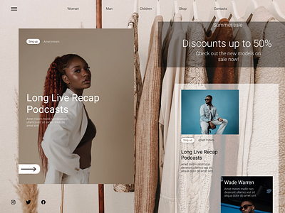
Clothing store landing page
Clothing store landing page
The layout and design was developed in Figma.
Photos taken from various sources
The combination of three colors made the landing more minimalistic and calm. The icons themselves minimally and succinctly fit into the style of the design itself, which makes the overall concept of such a playlist more natural.
More by Kirill Sheglov View profile
Like
