Personal Brand | Sleek, Artistic and Iconic


Personal logo are the hardest things to develop and design. What do you put into them? How much personality do you want to infuse with them? Will I look like a corporate robot or a just an amateur designer?
The balance needs to be quite well polished and refined.
A little backstory
I've been working on my personal brand for a long time, reiterating on it any time I had a chance, since I started designing back in 2016 (it's more than five years ago!).
I went through ideas and concepts that were all brilliant and well executed indeed, but that weren't clicking at all. The reason was that I had no clear vision of my why's, my strengths and my goals as a professional.
My "Eureka!" moment
After six years of designing, developing, startupping and doing business and consulting, I developed a stronger vision of why I am as a professional and what I want other people (customers, colleagues, prospects) to take away from me. And this solid base made the whole branding process much easier this time.
Canvas where filled and an amazing framework was used (more on this later on 👀) and this concept emerged.
I wanted to achieve a very refined and sleek look, pretty bold but not screaming bold - more of a behind the curtains bold. It's fresh, young, creative but also mature. And it's filled with vision, poetry and a splash of irony here and there.
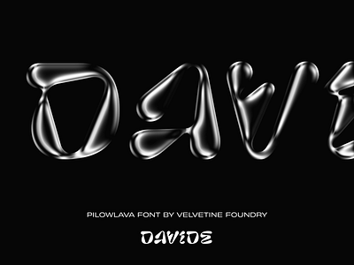
The amazing Pilowlava Font from the even more amazing Velvetyne Type Foundry has been used for this case.
I chose a selection of website sections and graphics to show you the directions and concepts behind it and I'll roll more out the following weeks.
A live preview version is already on my website: https://davidegiovanni.com