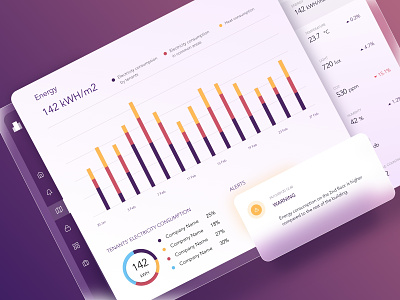
Sensors dashboard
Hi everyone 👋!
Visualization is the core of perfect data understanding 🤩.
Check out the following illustration 👇. The visualization helps analyze the entire building condition 🏢, utility consumption control 📊, access notifications 🔔, and monitoring alerts ⚠️ for a specific and collective data reading from sensors.
An interactive dashboard with various types of data visualization implemented will help real-time track parameters 🔎, make economic decisions 👍, and manage costs 💰.
------
We're available for new projects! Just drop us a line at office@synergycodes.com
