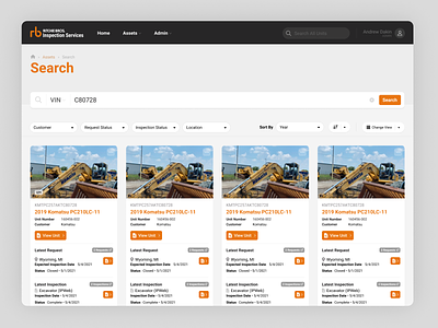
Search Results Redesign
The old search in this system was disjointed and the results users were looking for were hard to find. I started by combining all three types of results into a single returned result. I grouped the results by asset since all assets can have multiple requests and inspections assigned to them. This made it easier to see the status of each asset and gives the user a single place to look every time they search for a unit. I also added filters, sorting, and paging to the results to allow an easier way to narrow down what is returned.
More by Andy Dakin View profile
Like


