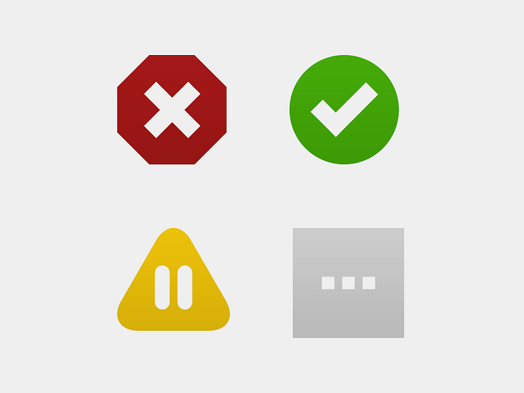
Status Icons for Dead Man's Snitch
These icons don't really appear that revolutionary. In fact, they are pretty obvious. What I think makes them cool is what they are replacing and the difference they will make.
In our original version of Dead Man's Snitch, status for the jobs you were monitoring was given only through color. We learned through feedback something we should have thought of in the first place. Many color blind people can't tell the difference between red and green. So our status indicators sucked. They meant nothing and made using our app harder than it needed to be.
In rethinking status icons for our app I made sure that we indicated status through the shape of the indicator, the icon in the indicator, AND the color of the indicator.
What you see here (left to right, top and bottom) Failing, Passing, Paused, Pending. There should no longer be a question when scanning your snitch list what is working and not working.
