LeVert Beauty Logo
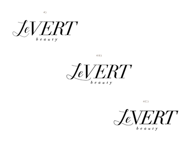
This is a logo for a high end, green beauty line. We can't decide on which one.
- 4 has a funny space next to the V. - We filled that spot in on 4B which also connects the words as 1 (what the client wants) - but now does your eye just go straight to that gap again? - We altered the V on 4C to get rid of that space. Does the V look funny now?
All Critiques welcome!!
More by October Ink View profile
Like
