My how I've grown!
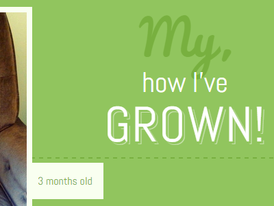
Using flexbox, I created a responsive, full-width layout showing my son's growth from 3 months to 3 years. Flexbox makes it easy to pin the photos to the sides and center the text in between, and then re-order it all on narrow mobile screens. See the full layout and read how I made it at http://zomigi.com/blog/full-width-pinned-layouts-with-flexbox/.