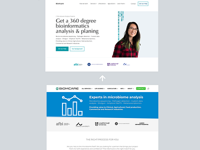
Biomcare - Landingpage 5 second review & mockup suggestion
About: Biomcare is a Danish-based Health-tech startup that helps universities, hospitals, researchers and specialized industries with microbiome analysis.
Suggestion: Based on a five-second usability test of the current site. It's a complex service they provide, so simplifying their value proposition and CTA is a good challenge. The site is full of good information, all relevant depending on customer type.
In my mockup suggestion, I have tried to underpin the message they are ready to help. Something they mention many times on their site. Which makes sense, regarding the complexity of their service. The rest was just a 2022 facelift of the UI/UX, which In my opinion makes the site more readable and I wrote a new value proposition that tried to capture everything they are selling to their clients.
In the hero, I included an image of a person, to make it more clear that the customers are working together with the team personally. The used image is just a stock photo placeholder - would be best with one or more founders.

