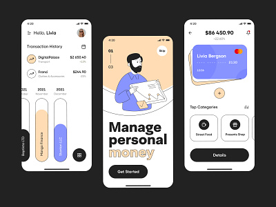
Personal money optimisation app
Hey all,
And so, here, it will be important for me to collect your point of view — how do you draw such a style not only for illustrations but also for the UI design itself?Why am I asking? For me, it is most unusual to create something like that and even more so for the Finn century, but in my opinion, it turned out very fantastic and exciting. Working with a color palette and outline stroke has its own charm, and the chart bars played an important role here. Financial planning has long required non-standard solutions, not only in terms of thinking but also design. Do you agree? Press “L” and drop me a comment — let’s discuss
Design — Figma
Illustration — Adobe Illustrator
************
💌 I am open to new projects! hey@migulko.cz
************
More by Taras Migulko View profile
Like

